
I prefer the new behavior.
From: observium-bounces@observium.org [mailto:observium-bounces@observium.org] On Behalf Of Adam Armstrong Sent: Friday, December 14, 2012 4:20 AM To: Observium Network Observation System Subject: Re: [Observium] popup overview graph set positioning
On 13/12/2012 13:26, christopher barry wrote:
Greetings,
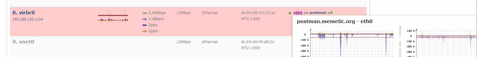
Nice looking application. Playing with the demo now, and noticing that
when I hover over a link (e.g. postman.memetic.org on URL
http://demo.observium.org/devices/type=server/) it produces a slick
overview popup.
Whilst we're on the subject of popups...
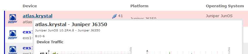
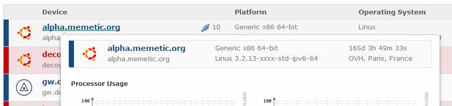
I've recently changed the device popup to include a header in the same style as the devices list. Is this better or worse than the previous style (basically had hostname & os in text)?
Old style:
[gd]
New style:
[sdfs]
What should I do for other popups? The ports popup has long needed to have extra information added to it. Quite often when these links appear there is no information for the port/device other than the hostname/port name.
[cid:image003.jpg@01CDD9F3.B3C7ABA0]
I think having two boxes on the port popup would be OTT, i don't really want to use more space than we're currently using on the device popup.
I also want to redo allof the graph popups to have a little bit of extra information on them, as they look a little bare atm.
What do you guys think? (I already know Tom hates *) :P
adam.