
Hi Adam,
Hmm. Would you please point me to the place in the code where I can find the call to rrdtool that generates these particular graphs, so I can play with it myself?
Hovering over the daily graph to get a larger image gives me a graph for what appears to be the same timeframe with the correct legend/figures.
Apparently all the daily minigraphs have this problem. For background, I'm trying to set up a front page with 'very important' ports using minigraphs so a) I can get a fair number of them on the screen and b) I can finally phase out MRTG.
Our network engineers would much rather see the actual max show up on the daily graph, even (or particularly) if it's ugly. Having the weekly graph show a 50% larger spike than the daily for the same time does seem a little extreme.
Thanks, - Richard
On 04/05/2018 14:15, Adam Armstrong wrote:
rrdtool works in mysterious ways.
the 24 hour graph probably isn't showing 5 minute resolution of the data (and doesn't show the "max" shadow because it's ugly).
adam.
------ Original Message ------ From: "Richard Kuhns" <rjk@wintek.com mailto:rjk@wintek.com> To: observium@observium.org mailto:observium@observium.org Sent: 2018-04-05 18:45:09 Subject: [Observium] A graph that doesn't quite match the data
Hello,
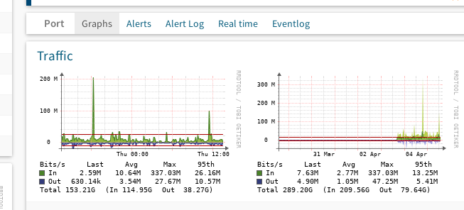
Here's a screenshot of 2 Traffic graphs for a 10G port on a Cisco 6509. The second (week) graph seems accurate, with the spike indicating a little over 300M bits/s. The first (day) graph indicates that the same spike is only 200M bits/s. The actual numbers under the graphs agree that the max is 337.03M.
Traffic
Why doesn't the first graph show the actual value?
This is on v 18.3.9125.
Thanks,
-- Richard Kuhnsrjk@wintek.com Wintek Corporation 427 N 6th Street Lafayette, IN 47901-2211
Main: 765-742-8428 Direct: 765-269-8541
observium mailing list observium@observium.org http://postman.memetic.org/cgi-bin/mailman/listinfo/observium