
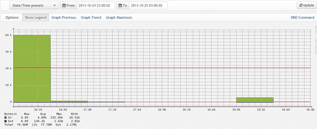
Hi guys, I have a question on graphing. Last week I took some screen shots of our graphs for a specific simulation and then checked again this week for the exact same time periods and the numbers are the same, but the graphs are different. How does the graphing work exactly? In this first picture, we were wondering why the 225.05k isn't showing on the graph. It only goes up to 40k: [cid:image001.jpg@01CEF109.7988A100]
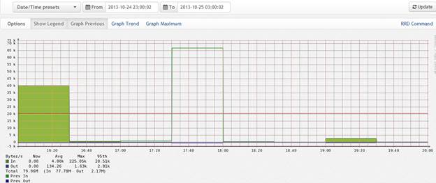
When I checked this exact same graph with the same date and time stamp a week later, the numbers are the exact same, but the graph has changed although still doesn't go up to 225.05k, but does go up higher to 75k:
[cid:image002.jpg@01CEF109.7988A100]
Any help or insight is greatly appreciated!
Thanks, Josh ________________________________
This electronic mail (including any attachments) may contain information that is privileged, confidential, and/or otherwise protected from disclosure to anyone other than its intended recipient(s). Any dissemination or use of this electronic mail or its contents (including any attachments) by persons other than the intended recipient(s) is strictly prohibited. If you have received this message in error, please notify us immediately by reply e-mail so that we may correct our internal records. Please then delete the original message (including any attachments) in its entirety.