
17 Jul
2015
17 Jul
'15
2:15 p.m.
Hi All!
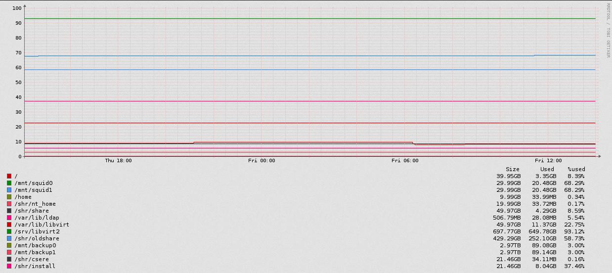
I was thinking whether there is some way to make the graphs more user friendly. I am talking about aggregated RRDTool graphs that have more data lines in it. One example (as seen in the attached screenshot) is the typical filesystem usage graph of a linux host, that has a legend below it, but as the colors are not quite unique (at more than 5-6 data lines some colors will overlap inevitably) you can't really find out which line is which. If you want to find out which data line has that glitch that you saw in the aggregated graph, there is no other way than looking at each data separately.
Is there a way/plan to overcome this limitation?
Regards, Tylla